inGENium
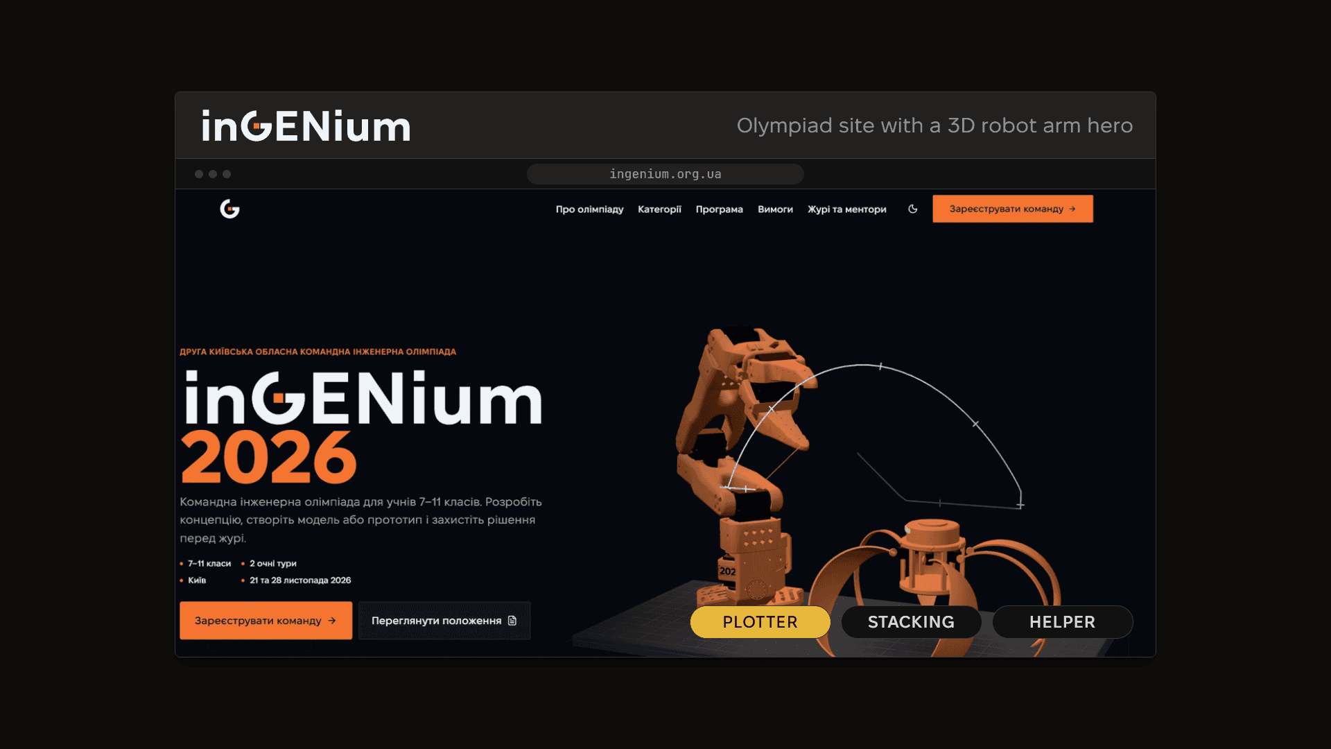
The registration site for a team engineering olympiad for grades 7 to 11, with a 3D blueprint robot arm and the Robo Spider
inGENium is "Друга київська обласна командна інженерна олімпіада", the second Kyiv regional team engineering olympiad, for school students in grades 7 to 11. It runs as 2 in-person rounds. The site at ingenium.org.ua is where a school registers its team, reads the regulations and follows the season from there. It was a joint order from A+, the education holding, and KAI, Kyiv Aviation Institute, which is my own university. I built the site and the CMS behind it, and the whole thing took about a month.
The people it's for are kids. A new generation, the ones who grew up with interactive everything, and they really expect a website to do something when they touch it. So a boring site was out, and so was a small one. And by small I mean two things: small type, and a page that's just a row of buttons, 1, 2, 3... and so on. Then there are the parents, who need to understand what their kid is signing up for. The site has to work for both of them at the same time.
So the layout is a common one, on purpose. The hero has the headline and 2 main actions. "Зареєструвати команду" (register a team) opens the organizers' registration form, and "Переглянути положення" (read the regulations) opens the regulations file. Right under the hero, a strip shows the current stage of the season with a live countdown and the action that fits that stage, so once registration closes the button reads "Реєстрацію завершено" (registration closed), and later "Переглянути результати" (see the results). Everything else comes after: why take part, what the olympiad is, the first season in numbers and its results, the age categories, the details tabs, the jury and mentors, photos from the previous olympiad, the partners, and a last call to register.
Not small also means the type itself. Body text is 16 px on an ordinary screen and keeps growing past 1920 px wide, up to 32 px on a 4K screen, and the display headings run fluid from 36 to 72 px. Headings are in Wix Madefor Display and the body is in Fixel. Every touch target is at least 44 by 44 px, and on a phone the hero button runs the full width.
The photos are real ones, from the previous olympiad. They hang as a "salon wall" with blueprint crop marks, paging and a filmstrip. The organizers manage that block themselves in the CMS, so whenever they want, they can add more photos, videos or YouTube links to it.
The Robo Spider and the arm
The orange spider on the main page is the Robo Spider, the site's mascot, and it's a real robot. It was a student project at the last olympiad. I modeled it in Blender from the archive photos, and then checked the model against those photos again.
The arm next to it is the SO-101, the open-source robot arm that students build, and it's there because engineering as a whole is the topic of the olympiad. It's drawn as a blueprint, in three.js through react-three-fiber. The idea from the very start was to make those two team up on the main page.
And they do, in a rotation of short scenes. In the repair scene the spider limps in on 5 legs, the arm seats the missing one, and the spider taps it, spins and hops. In the helper scene it goes the other way round: the arm's wrist and gripper come off, and the spider carries the part back on its cap. The arm prints a three-layer tower and the spider hops up on top of it and back down. In the calibration duet the arm draws a square and a figure 8, the spider copies it with its head, and then they both bow. In the wordmark scene the arm plants the orange square at the center of the G, draws its ring and bar, and the letters swing up while the spider stands behind the word. And in the plotter scene a laser follows your cursor, and the spider turns its head to the spot.
Every visit to the main page opens with the wordmark and the slogan. On a first visit, a cinematic intro of six shots follows, about 20 s long, where the arm places the spider's last leg and the spider unfolds, lights its eyes and waves. Then the hero takes over.
Big screens and phones
Both of them should pop, and each one gets what it can carry. On a large screen the arm and the spider sit beside the headline, the full rotation runs with the plotter following the cursor, the cursor itself turns into drafting tools, and the backdrop is a drafting grid with a spotlight under the cursor. A phone shows the text first and the visual after it. It gets a lighter 3D tier at 30 fps with fewer scenes, plain touch without a custom cursor or hover, and tabs that scroll sideways. A phone with a strong GPU gets the full tier anyway, and a weak device gets a still. The intro never plays for someone who asked for reduced motion, and on a phone it plays only on the full tier.
The compass G
I designed the logo. The mark is a G built the way you'd build an engineering drawing. It's a circle cut open along its vertical radius, the bar is the horizontal radius from the rim to the center, and an orange square marks the center, right where a compass needle goes. The logo guide puts it like this: "Everything in the letter points back to one measured centre, which is what engineering drawing is about." The letters are drawn from Geologica, an open-license typeface.
The palette is deep navy ink, pale blue accents and near-white or near-black grounds for the two themes, plus exactly one brand orange. The same orange carries the logo and the CTA's, and the student spider robot turned out to be that orange too, so the mascot, the mark and the button. The 3D scene uses it at a calmer saturation, and orange text takes a darker shade to hold 4.5:1 contrast.
The tricky parts
The arm aims at your pointer on the drafting plane, and that was more work than it sounds. The "elbow-up" solver flips to the other pose when the target crosses the camera axis, and a high target pushes the wrist past its limit. So the arm got a narrow switch band where it swings across smoothly, the jaw pitch follows the height, the gripper stops short of the spot, and the laser leaves the jaws at an angle. Joint speed is capped, a small dead zone takes care of the jitter, and when nobody's pointing, the arm idles along a Lissajous curve on its profile side. The laser trail uses the theme's line color.
The scenes needed a "director". Loading and compiling a scene in the middle of the rotation made the animation hitch, and on a slow connection some scenes just aren't ready in time. So a seeded shuffle-bag director names the next scene in each idle gap, and that scene loads and compiles while the arm rests at HOME position. A scene that isn't ready stays in the bag.
flowchart LR
  P[Scene plays] --> H[Arm rests at HOME]
  H --> D[Director draws the next scene from the bag]
  D --> L[Scene loads and compiles in the idle gap]
  L --> R{Ready?}
  R -- yes --> P
  R -- no --> B[Back in the bag, the gap waits few seconds]
  B --> D
The blueprint lines are the model's edges, and computing them in the browser cost main-thread tasks about 150 ms. On mobile, Lighthouse sometimes couldn't even compute the blocking time. So the edges are baked into the model itself, 30-degree feature edges stored as line nodes in the GLB, and the page reads them as typed arrays. The cinematic code loads only when the intro is actually due.
Scroll needed work too. The cursor, the header stages, the hero scroll and the smooth scroll each read layout and wrote styles in their own frames, which forced layout in the middle of a frame, and a few page-wide :has() rules restyled the page on every scroll. All of it moved onto one frame ticker with update, read and write phases. The cursor ring animates as a scale, the header stages as transforms, Lenis runs on the same ticker and switches off on touch screens, and the :has() rules became attributes. The intro also can't trap anyone. It's capped at 25 s, and the cap counts animation-frame time, so a hidden tab holds the intro where it is. Tab moves only between Skip and Pause, and the rest of the page stays inert until the hand-off.
Every UI string comes from the CMS through next-intl, so the organizers edit all the copy themselves. next-intl runs on the server, and the client gets a small string context that handles values and Ukrainian plurals with the built-in Intl, instead of carrying the full runtime.
Payload
The CMS here is Payload. I'd been following Payload for quite a while, and thinking that maybe one day I'd start using it. This is the first project where I actually ran a parity check between Strapi and Payload, against three of my Strapi 5 projects. Out of 59 features, 16 were native in Payload, 24 came by configuration, 12 needed custom code, and 7 got dropped.
For the places where it fell short, I built replacements. There's an access lock-down layer, API keys that sync at startup, depth and list-size limits on GraphQL and a REST lock for API clients. Revalidation hooks bring the organizers' edits to the site, a validator guards the reserved slugs, and the seed fills only the values that are empty. Later the form-builder plugin came in with bot protection, along with patches that translate the Payload admin into Ukrainian, so the organizers work in their own language.
All in all, the experience with Payload was only good, and pretty decent at that. So shout out to the Payload team, they did a wonderful job. At this point it's a really strong player among headless CMS's, because it can do a lot of stuff.
The site is Next.js 16 with React 19, TypeScript and Tailwind CSS 4, plus shadcn/ui, three.js with react-three-fiber, GSAP, Lenis and Motion. Payload sits on PostgreSQL, with media in SeaweedFS over S3. Since the "general visitor" are under 18, analytics is GA4 alone, behind a consent banner, with no session recording.
The organizers' marks belong to their owners.
Stack
- Next.js
- React
- TypeScript
- Tailwind CSS
- shadcn/ui
- three.js
- react-three-fiber
- GSAP
- Lenis
- Motion
- next-intl
- Payload
- PostgreSQL
- SeaweedFS
- Kubernetes
- Cloudflare
- GA4
Credits
- Kyiv Aviation Institute
- Short logo
- Архітектурно-інженерний колегіум А+
- Освітній холдинг А+
- Architecture and Engineering Collegium A+ logo
- A+ education holding logo
- Yehor Brodskiy
- InGENium wordmark and compass G icon